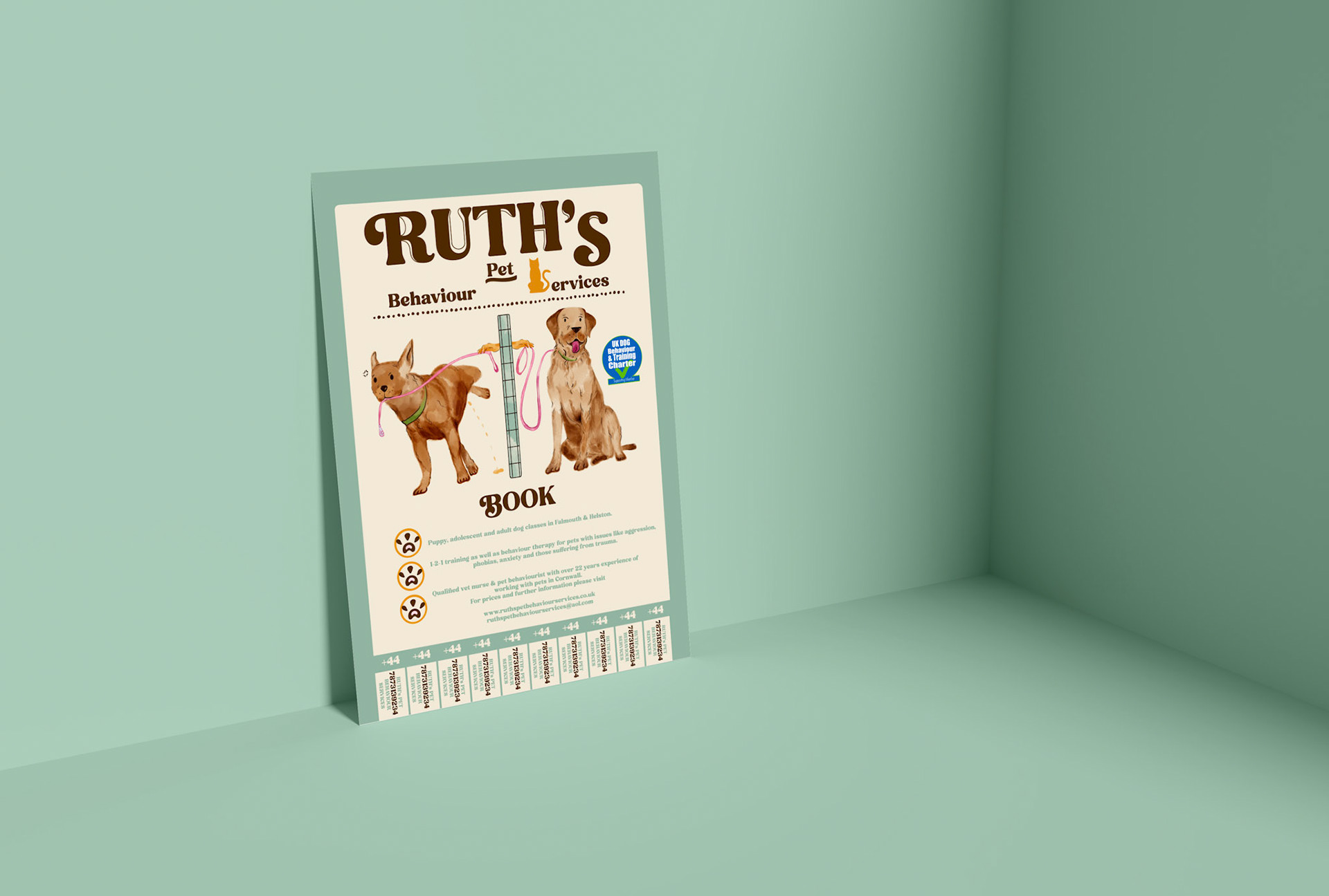
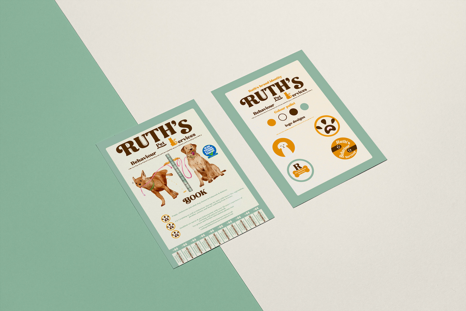
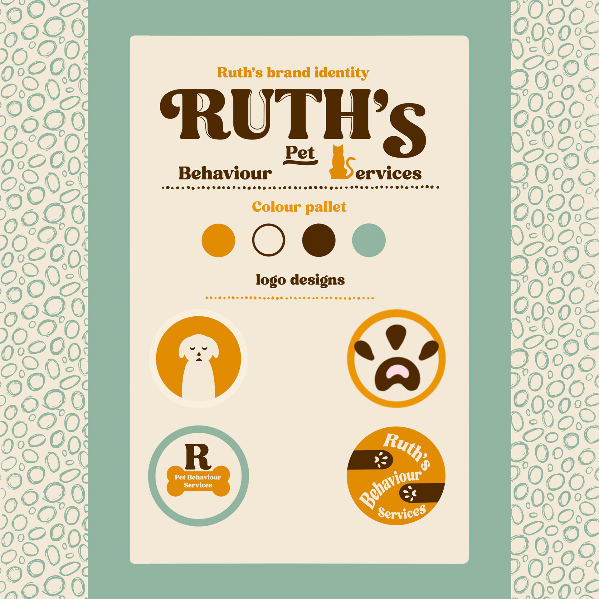
For Ruths brand identity I wanted to stay true to her brands purpose but not steer off too far from what she had already chosen. I didn’t want her to find something completely opposite to her original flyer (since I wasn’t communicating with her I had to in-vision what she would possibly like which proved difficult without her opinion). Intentionally I kept to the original colour pallet of the flyer with some extra additional colours that would compliment the piece. When I explored her instagram page through her website I noticed she didn’t have a logo which she could identify with so that customers could recognise her company so I included some different options she could choose from. On the original flyer I really liked the typographic element that included the cat and dog so I kept the idea in mind for this project. The typography had to be clean for clear readability but I also wanted it to feel lively (I used an interactive font but edited the font with some simple line work to make it more unique). I wanted the design to feel approachable and playful as animals tend to have that overly friendly characteristic.

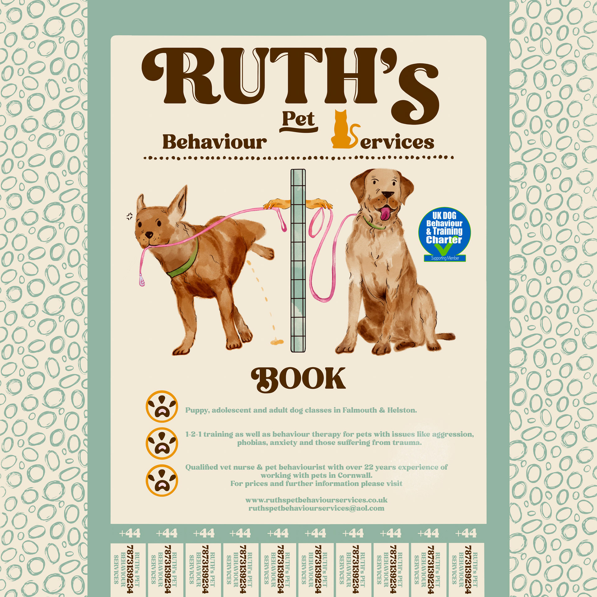
Redesigned flyer A3
Redesigned flyer A3
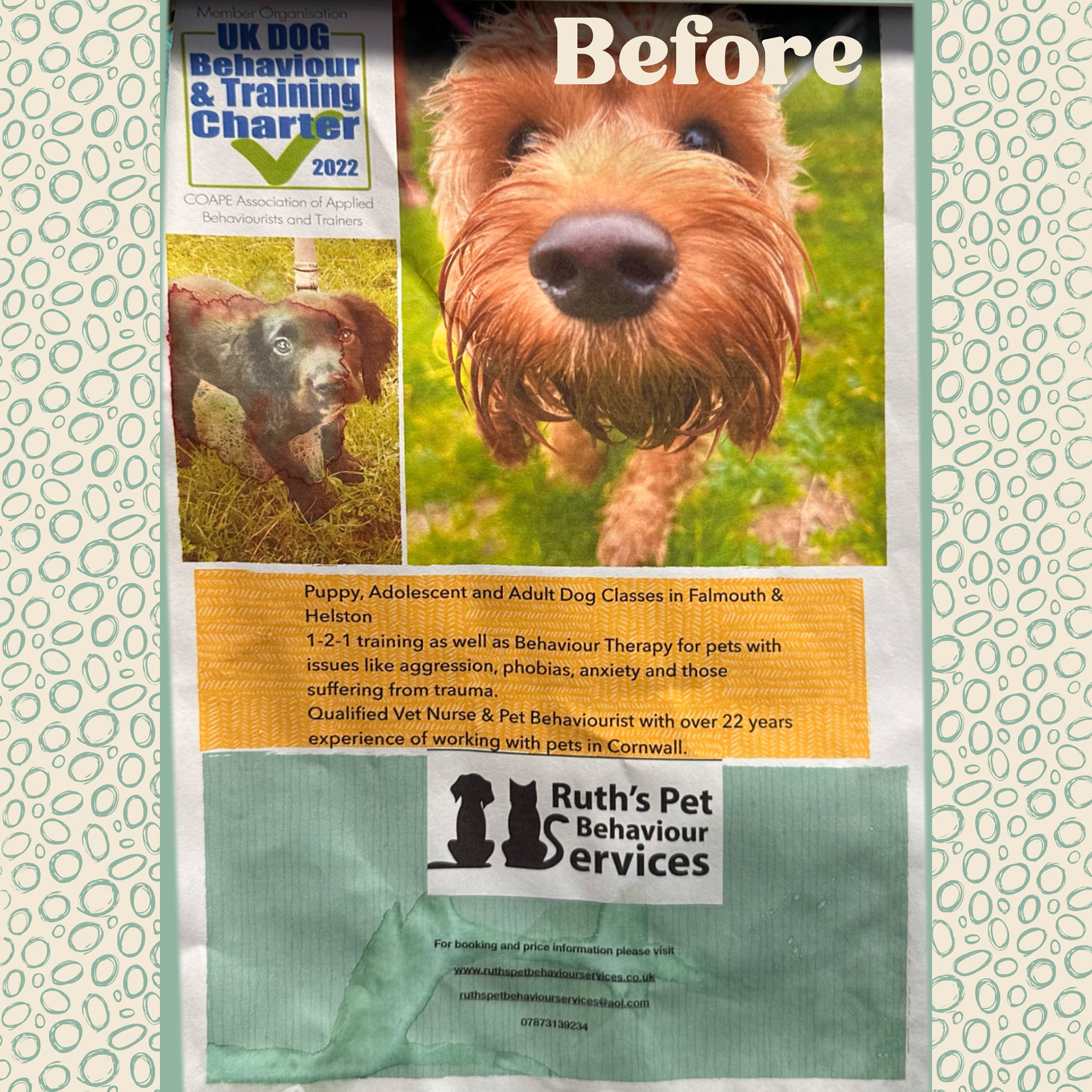
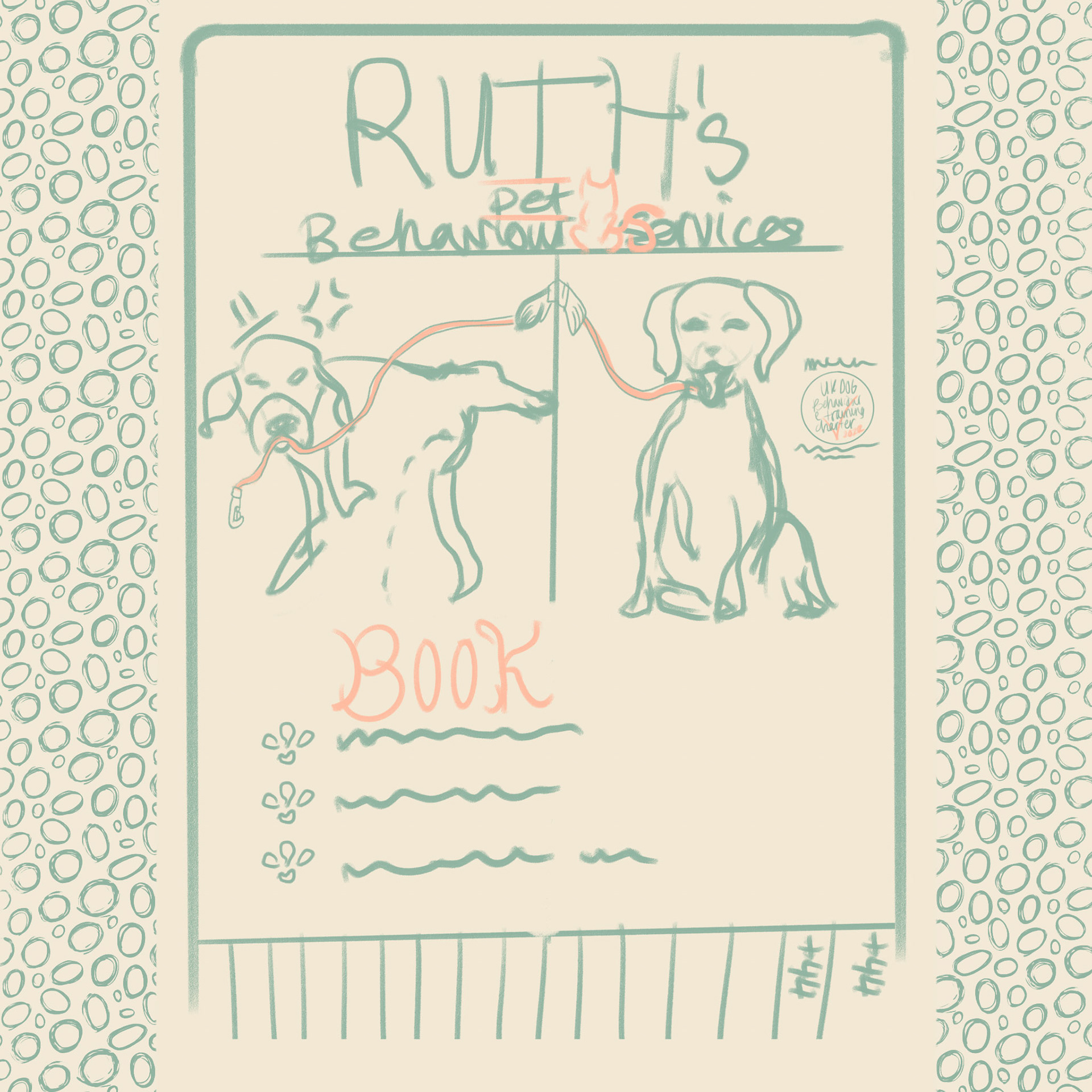
First  thing was sketching a digital version where I played around with composition and tried to envision the final result a much as I could. On the original flyer I didn’t think the information on how to book and get in contact was clear enough. The phone number was written in the smallest possible letter size. Which someone who can’t read well might struggle to gain the information of, just to give up and move on. So for the piece I wanted the number to be easily accessible and for it to be able to tear off, so that a client can take it with them in case they didn’t have time to process the information straight away. When I first identified the original flyer what really stuck out to me were the dogs but I wanted to add a comedic element to the “bad behaved dog”. This will be the main selling point so I opted for a watercolour illustrative before and after so that the client can envision what the service could offer.
Falmouth, Penryn & Area walking and cycling campaign

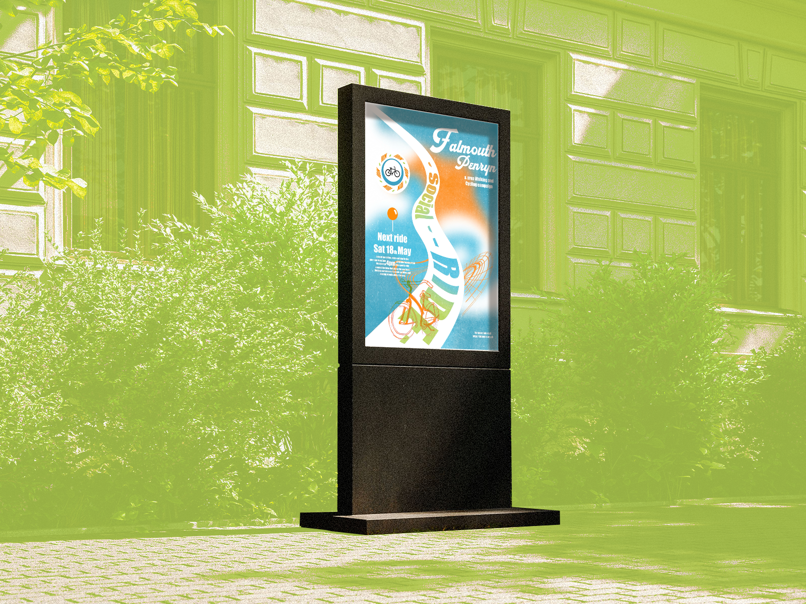
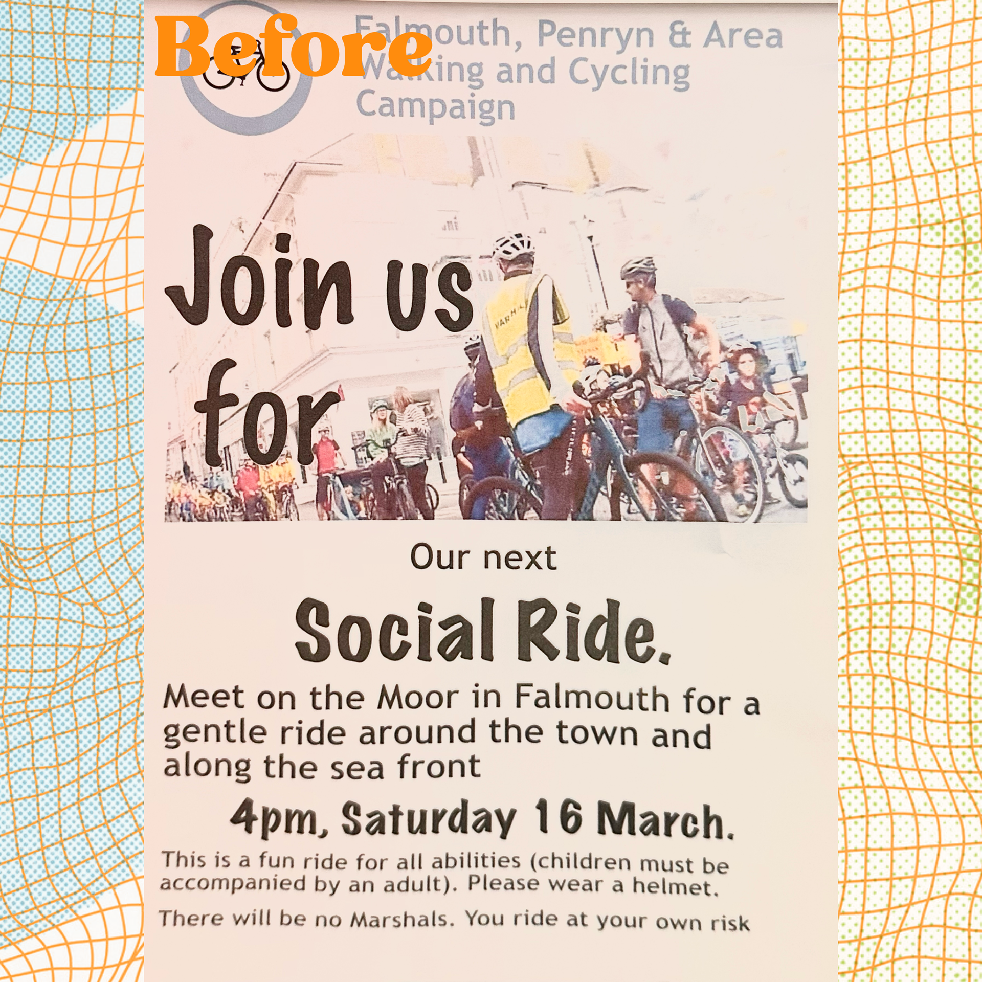
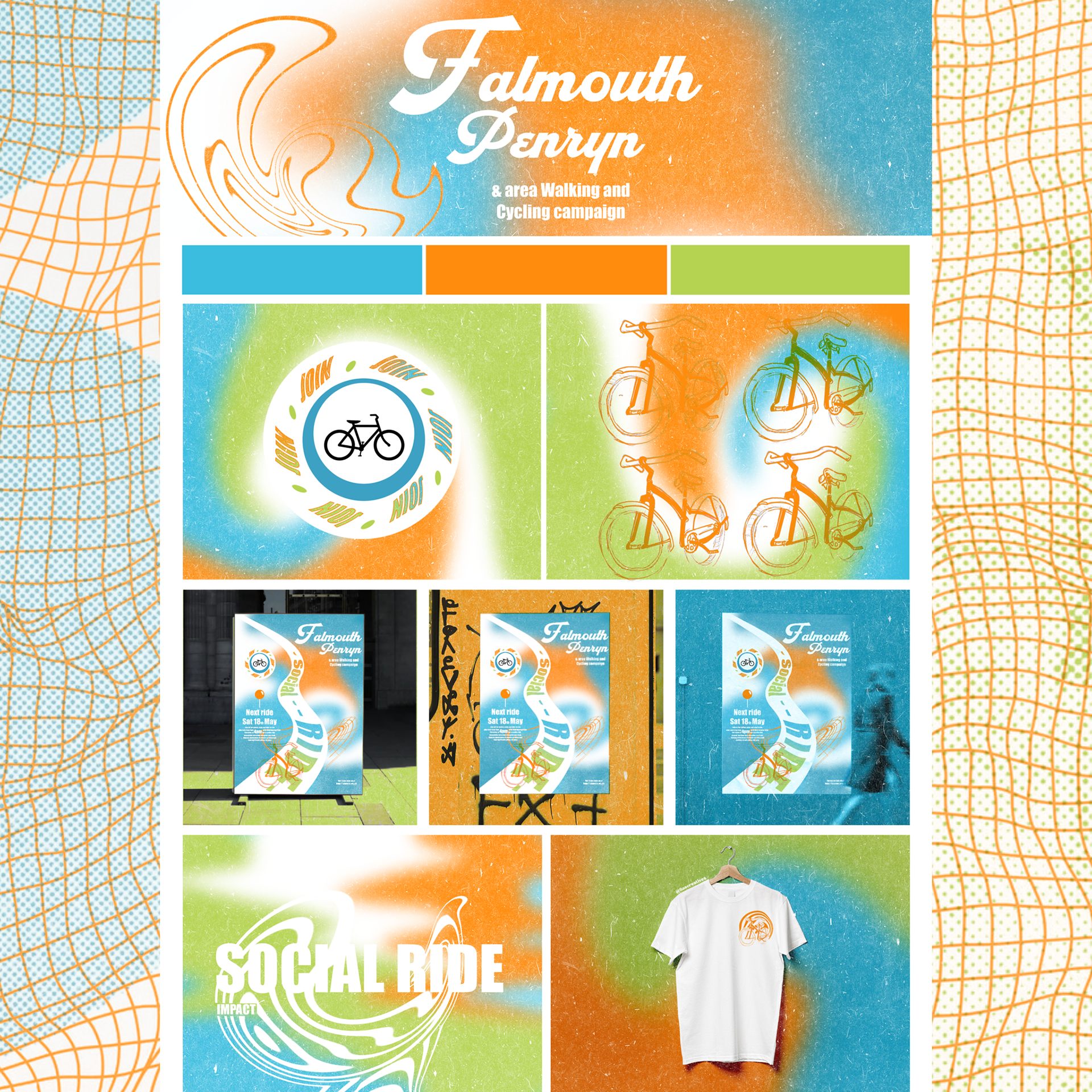
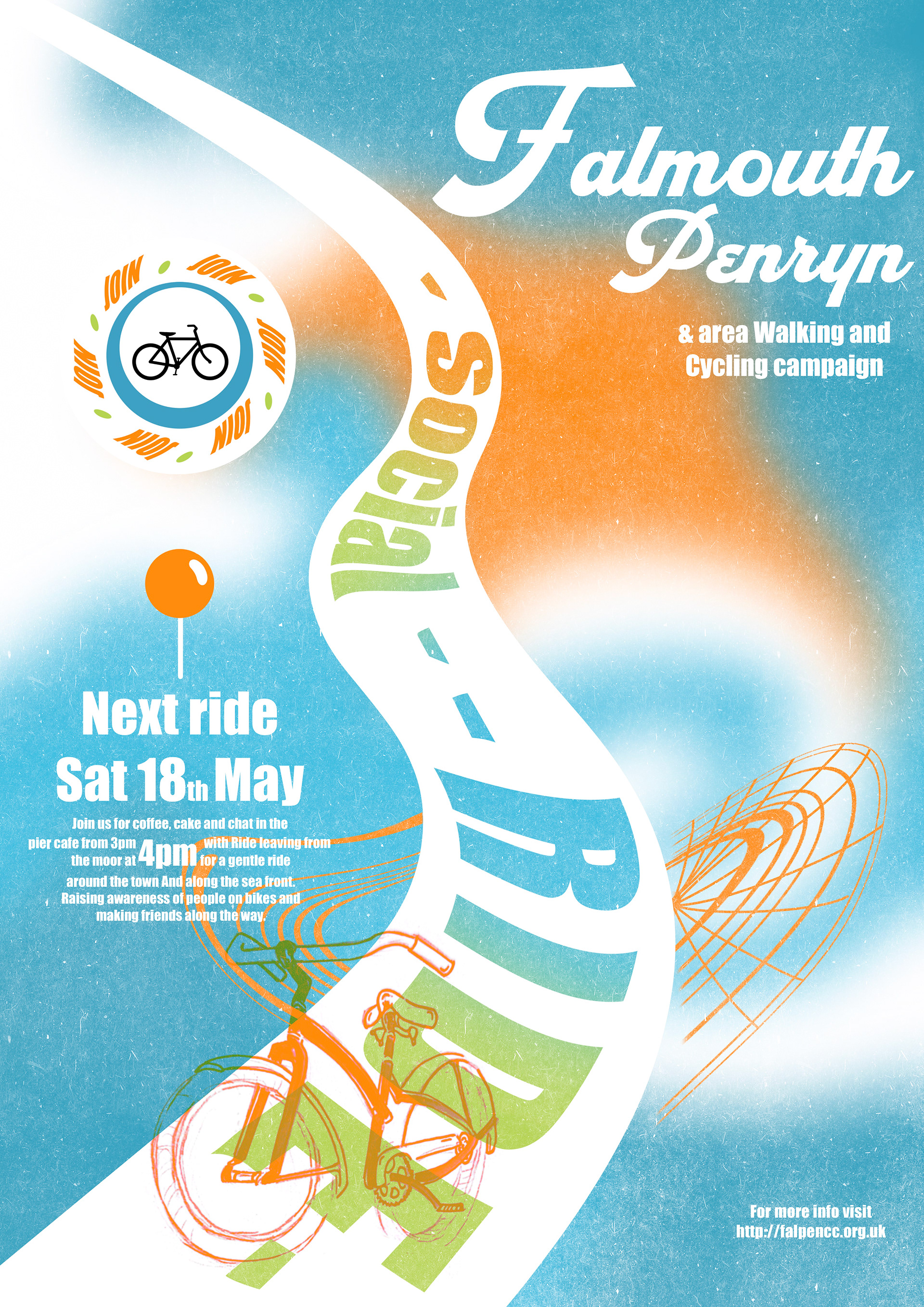
So this is the second redesign I did for our launch module. The Falmouth walking and cycling campaign, regularly host social rides or mass rides and meet at the Moor, trying to raise awareness for people on bikes and safer roads for cyclists. As a Dutchy I jumped at this idea as l've grown up with bike lanes and I do believe they are so useful. There's definitely a different culture here in the UK when it comes to cyclist safety as some people just want to run em over. This campaign is supported by the community and council here in Cornwall and I hope one day we might see some bike lanes here in the UK. Anyone and any age is welcome to join their social rides! Look up their website and Facebook to get more info on their next mass ride or updates!
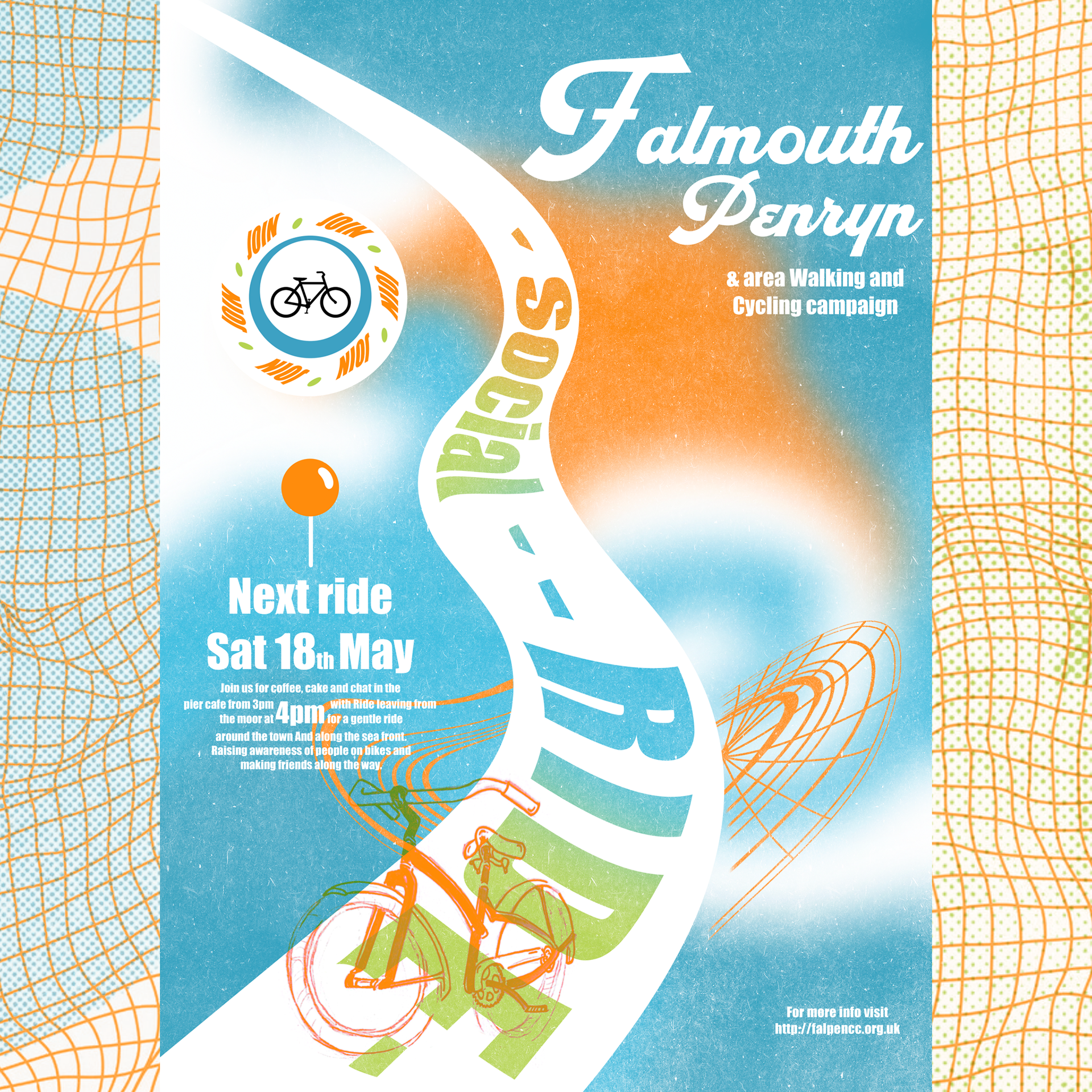
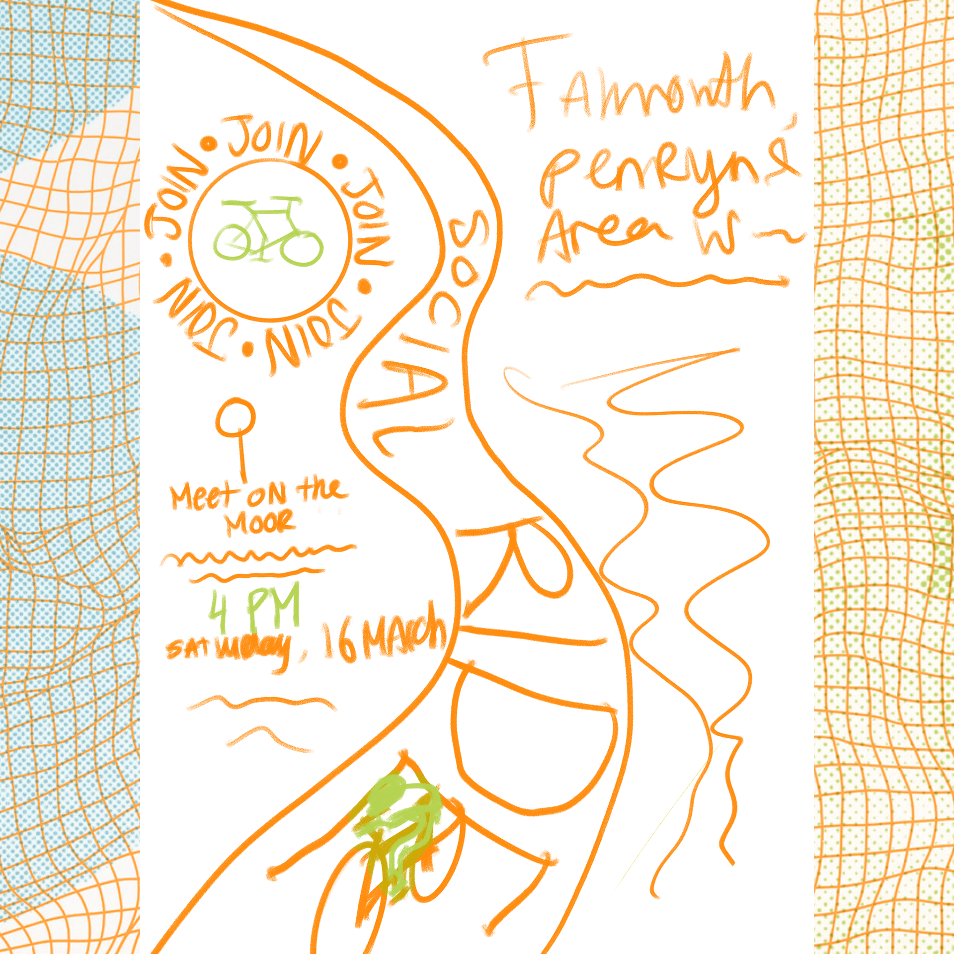
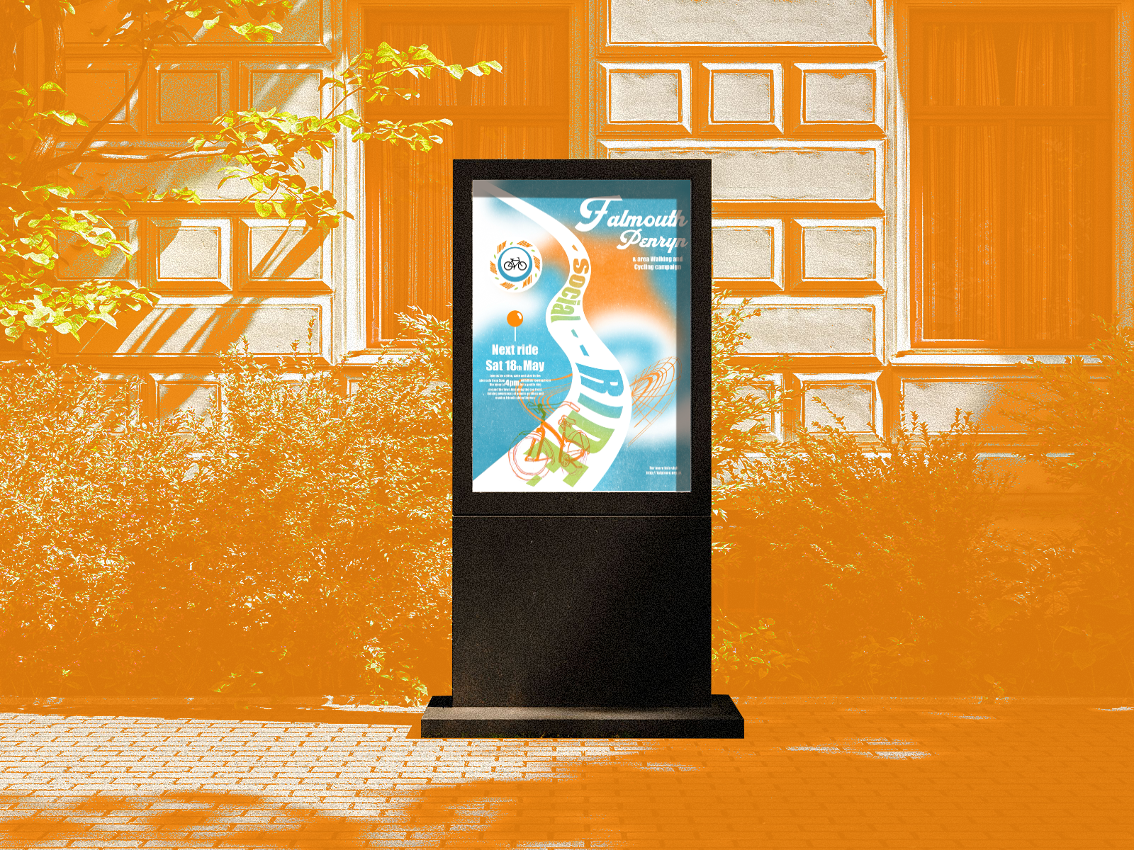
For the social ride redesign I envisoned story telling what the ride would be like; a path run down the middle with a cyclist conjoined with the typography (E) and next to the path the seafront they usually cycle past. I wanted the colour pallet to feel energetic so that the people who want to join can feel motivated and inspired with the bold colours. I felt in the original flyer the important information didn’t stand out enough so I planned on making it more visible and obvious.

You may also like

Back to Top