Recently we had the amazing opportunity to collaborate and take part in the Birmingham design festival symposium; for our last module called 'Design With' hosted by Luke Tonge.
Our brief was given by Marie Boulanger.
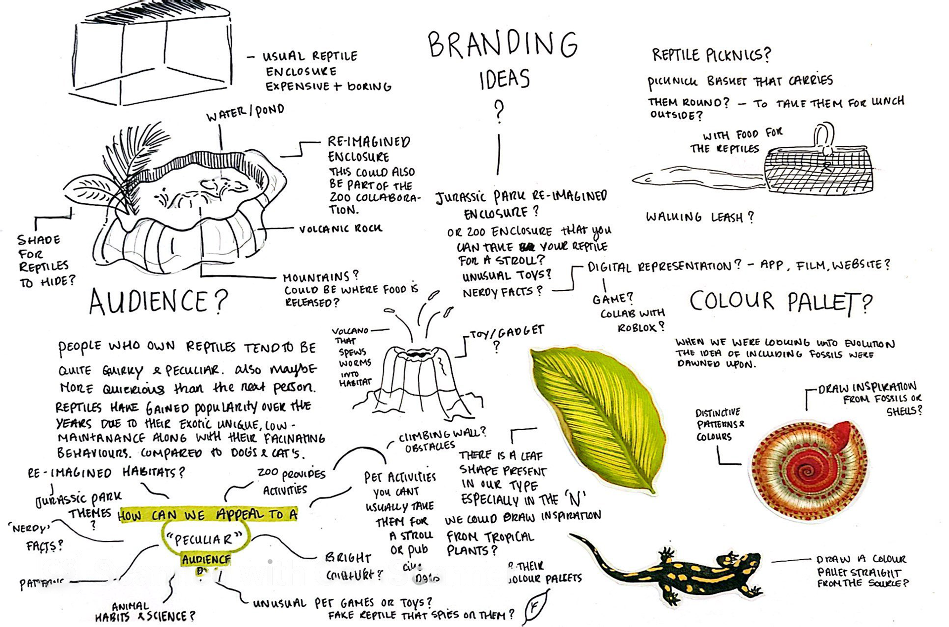
An organic pet food brand for non-traditional pets like reptiles and birds - Using those two ingredients, create a visual identity for your brand, centred around a word mark. All of the businesses want to stand out in their respective categories and cater to audiences who crave something new.
The brief focused on quality rather than quantity. Relying on a peculiar and non stereotypical type of branding including a unique physical outcome.
My teammates included Bethany Childs, Geka Petrulyte & Spencer Dibble.
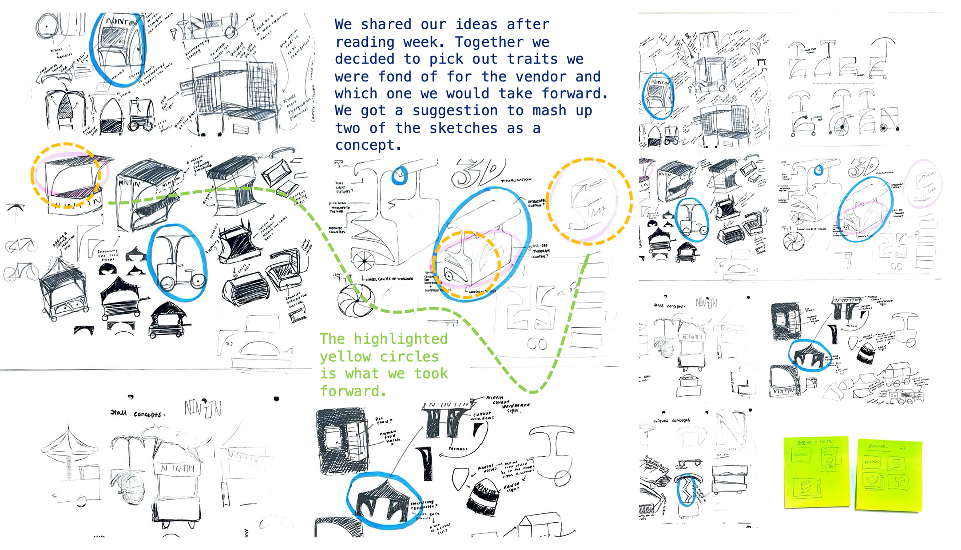
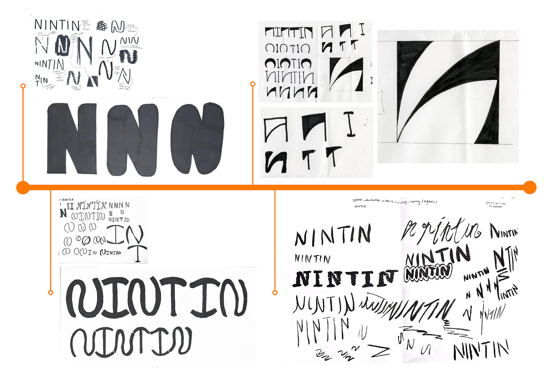
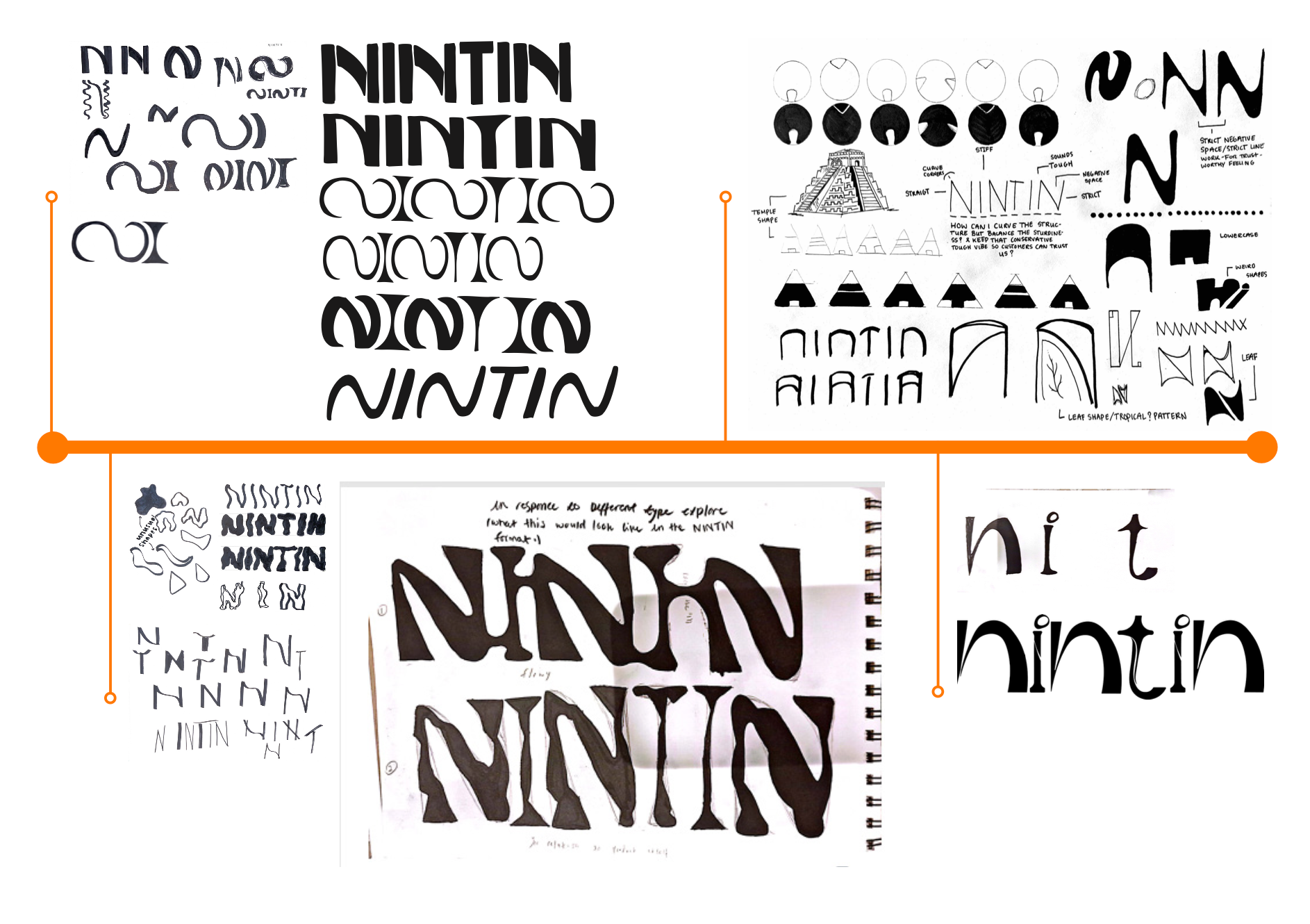
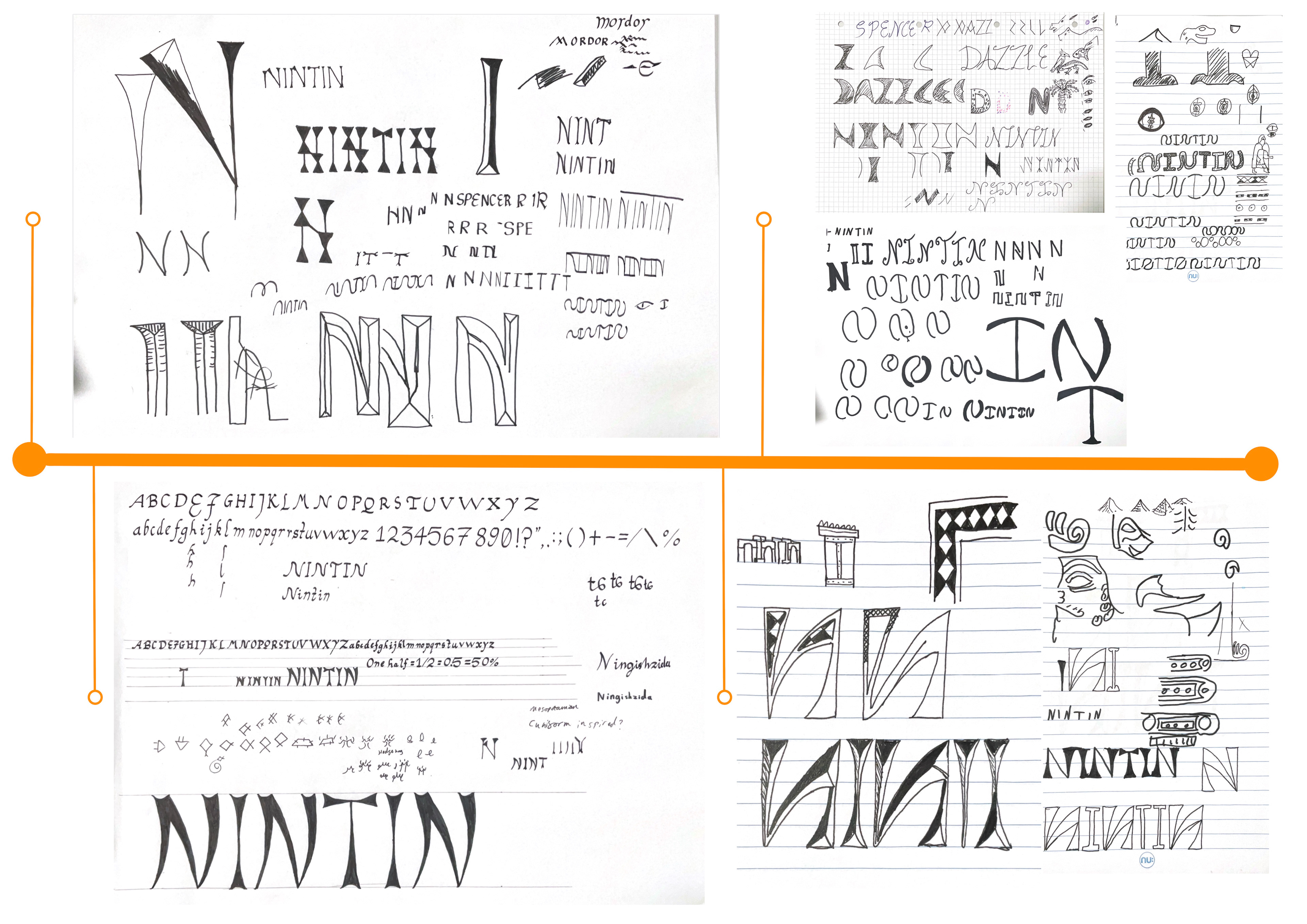
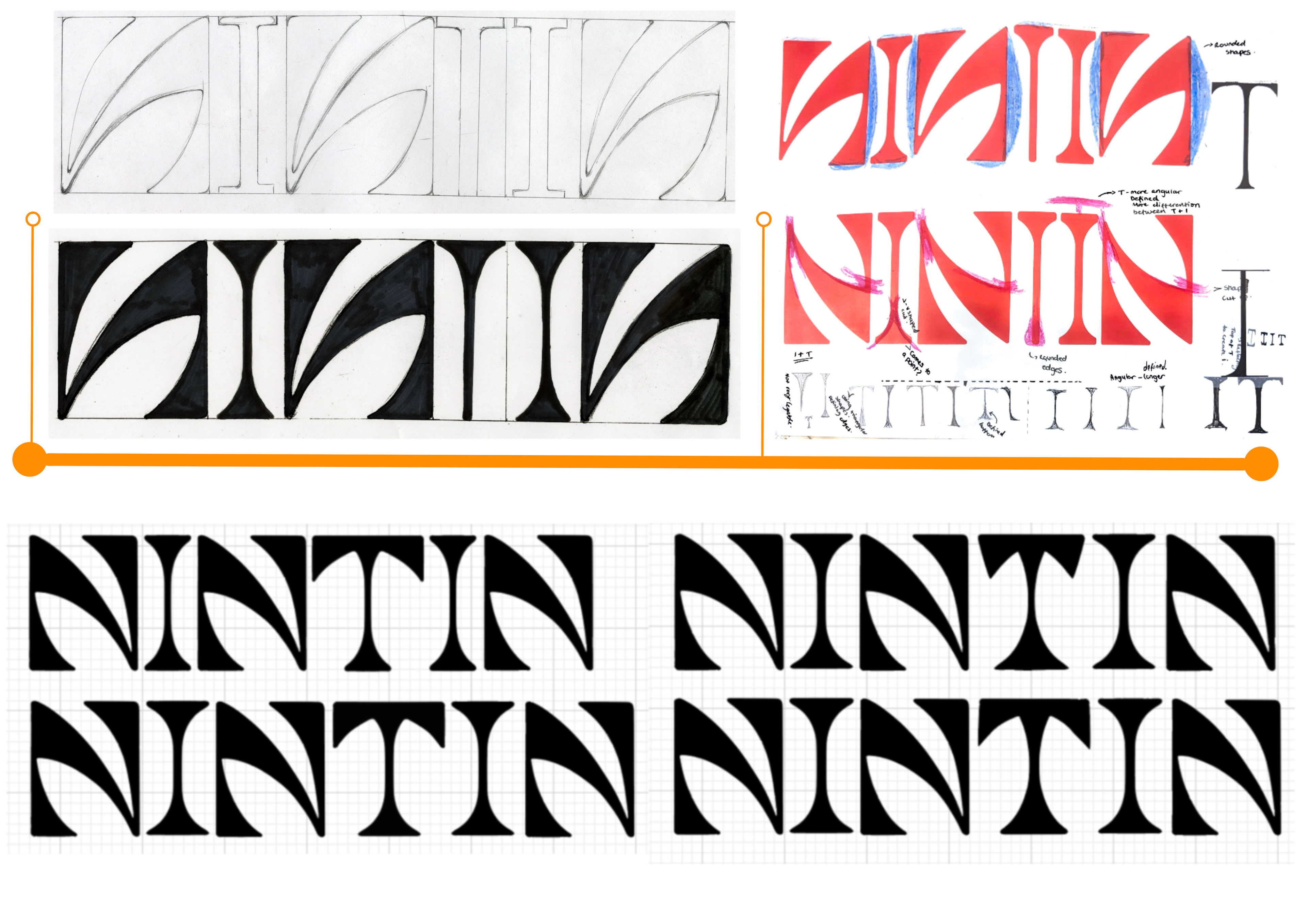
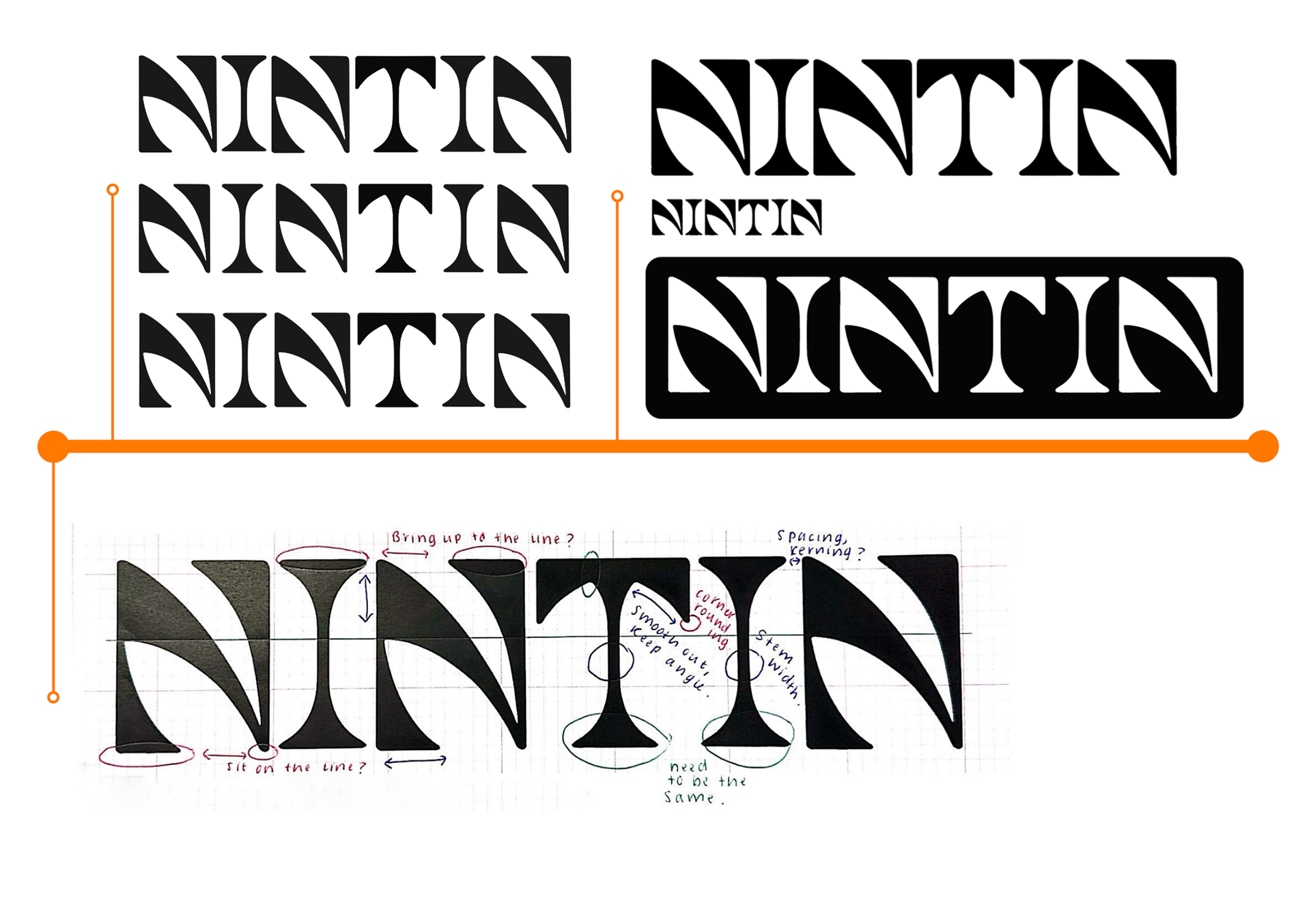
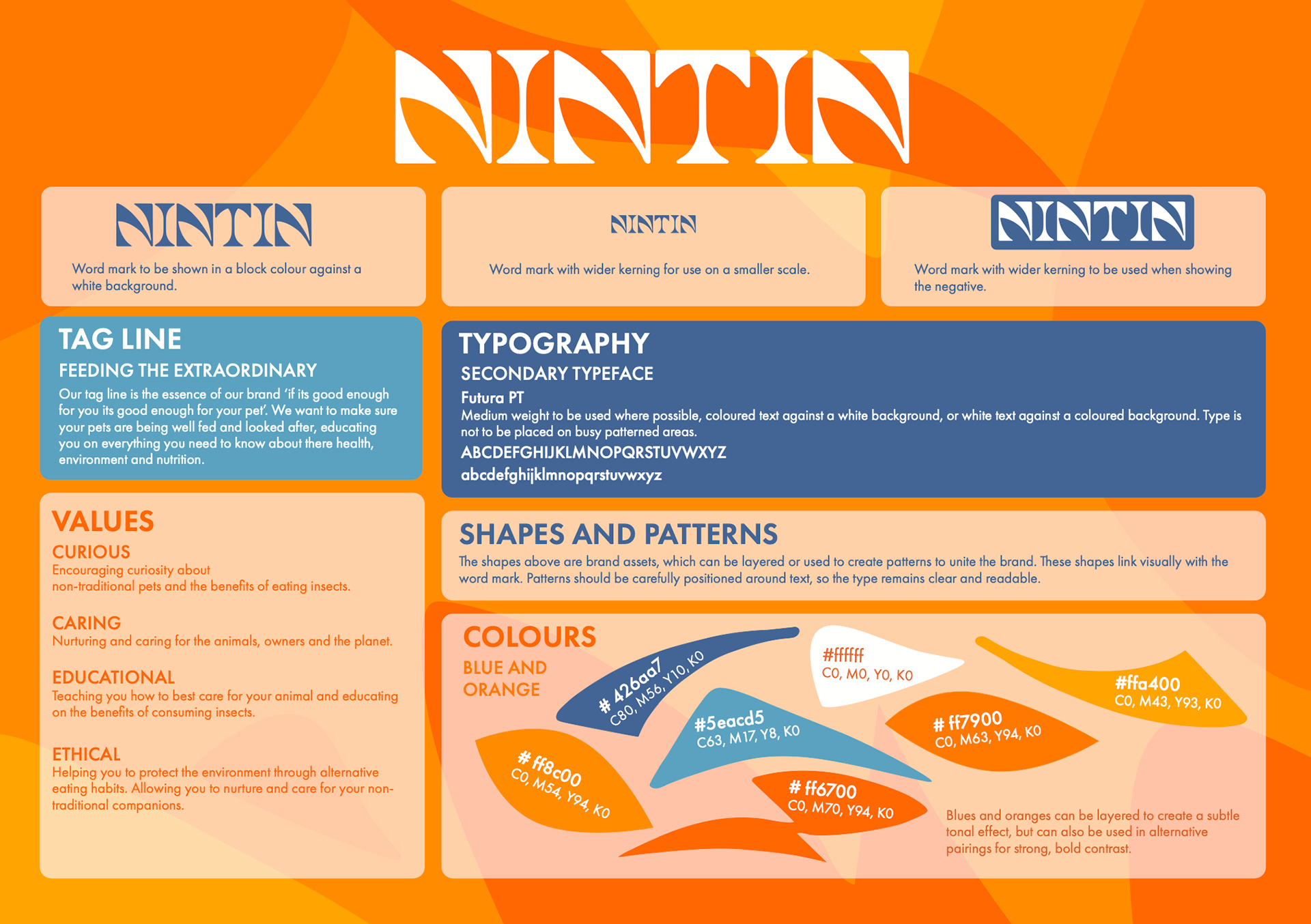
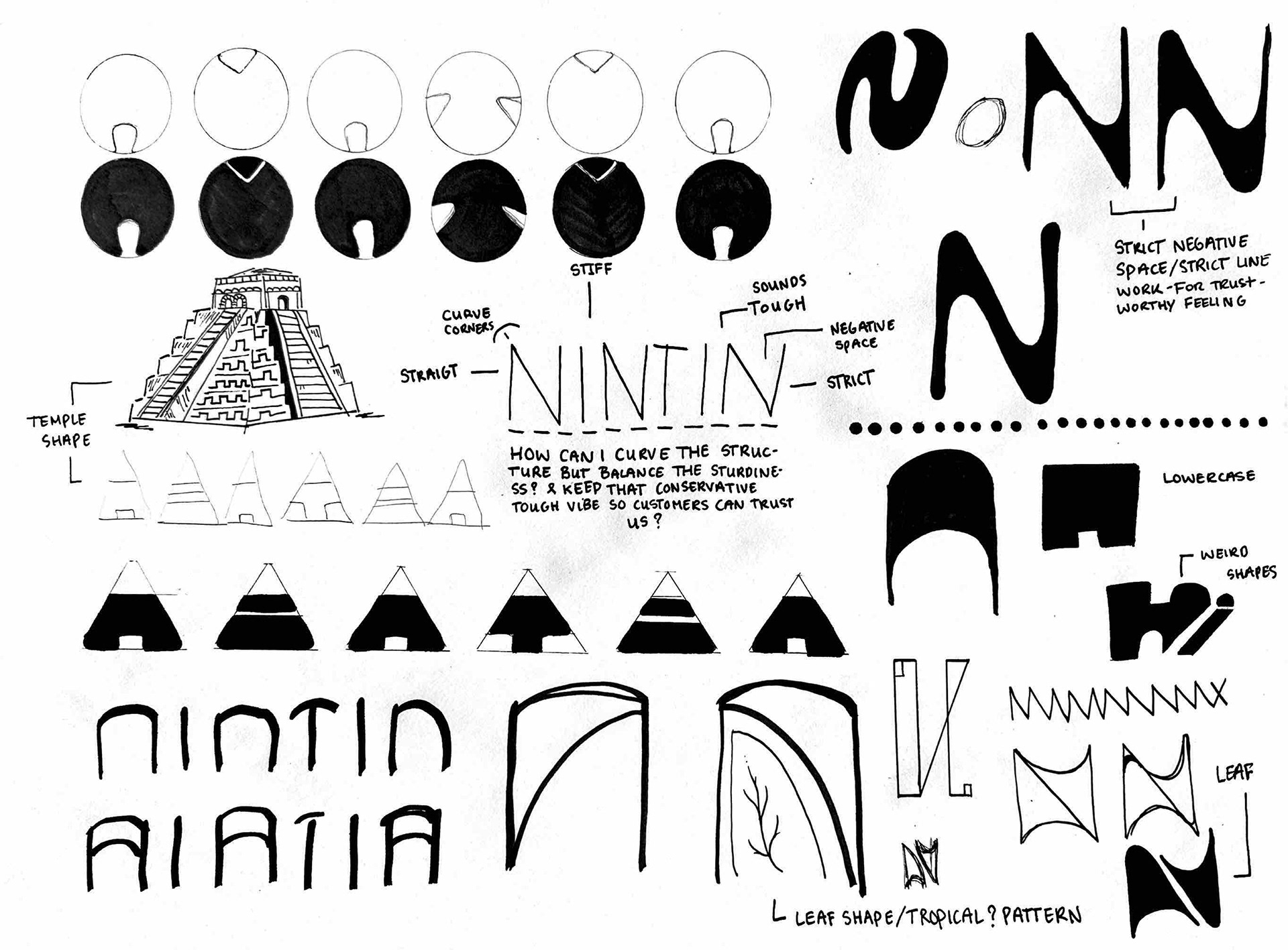
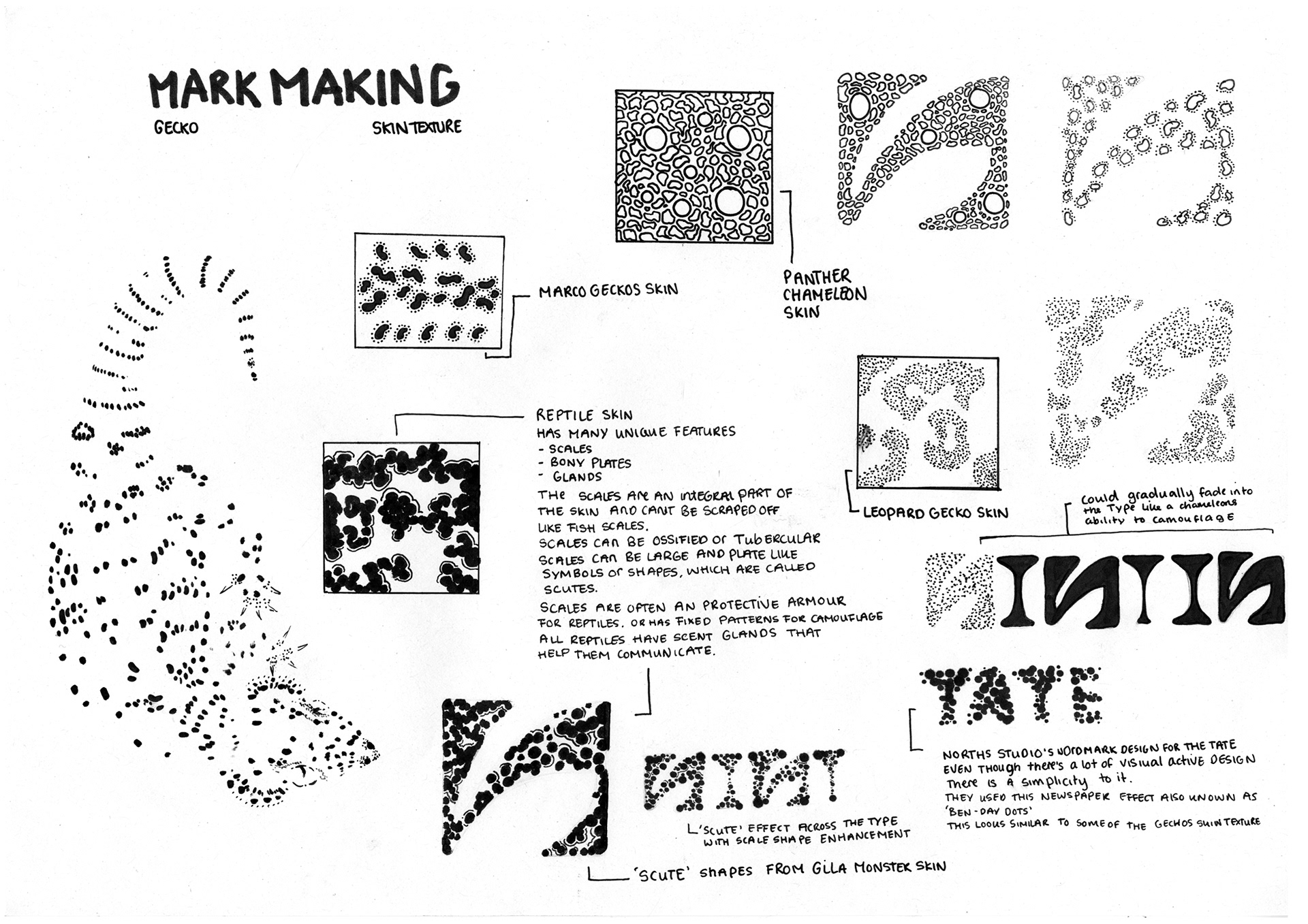
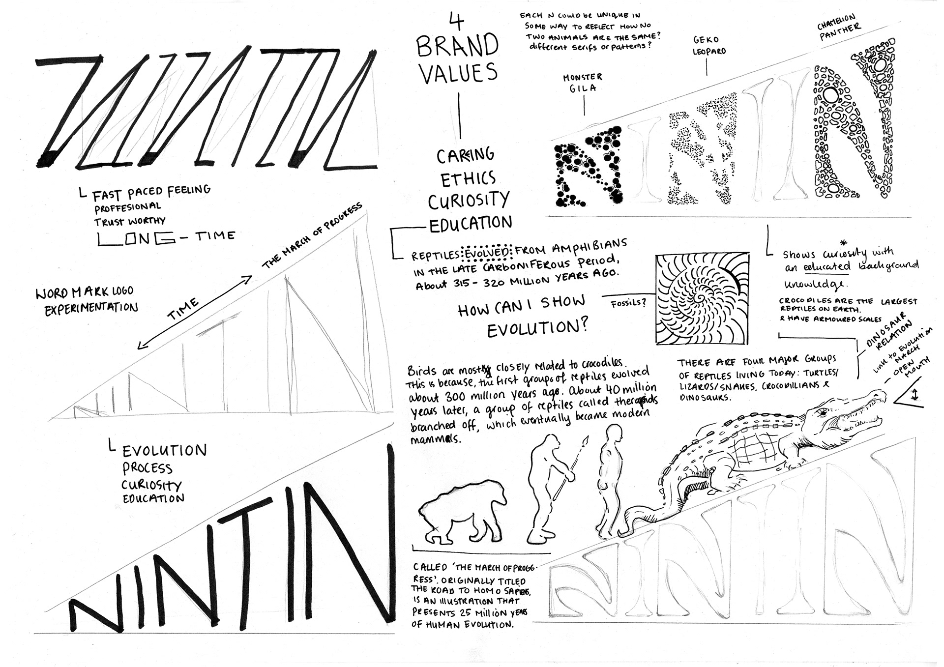
We started challenging traditions and archetypes of typography by questioning how we could curve the structure but balance the sturdiness? Or whether we could apply any physical shapes. Meanwhile, starting to decode the word “Nintin” paying attention to its unique qualities and processing how the structure is placed, repetitions in sound and shapes. How can we re-think the structure? Maybe curve it? Or do we want sturdiness for a sense of trust? Although is that already within the sound of the word? When we were researching other pet food brands, we noticed repetitive patterns in typography and branding when comparing different brands. Some had the same typography; not even trying to be its own distinctive character. Therefore, when we started looking at our brand values for our wordmark’s peculiar qualities, we needed to come from a clear ethical and educational point of view as a unique approach with a sense of playfulness.
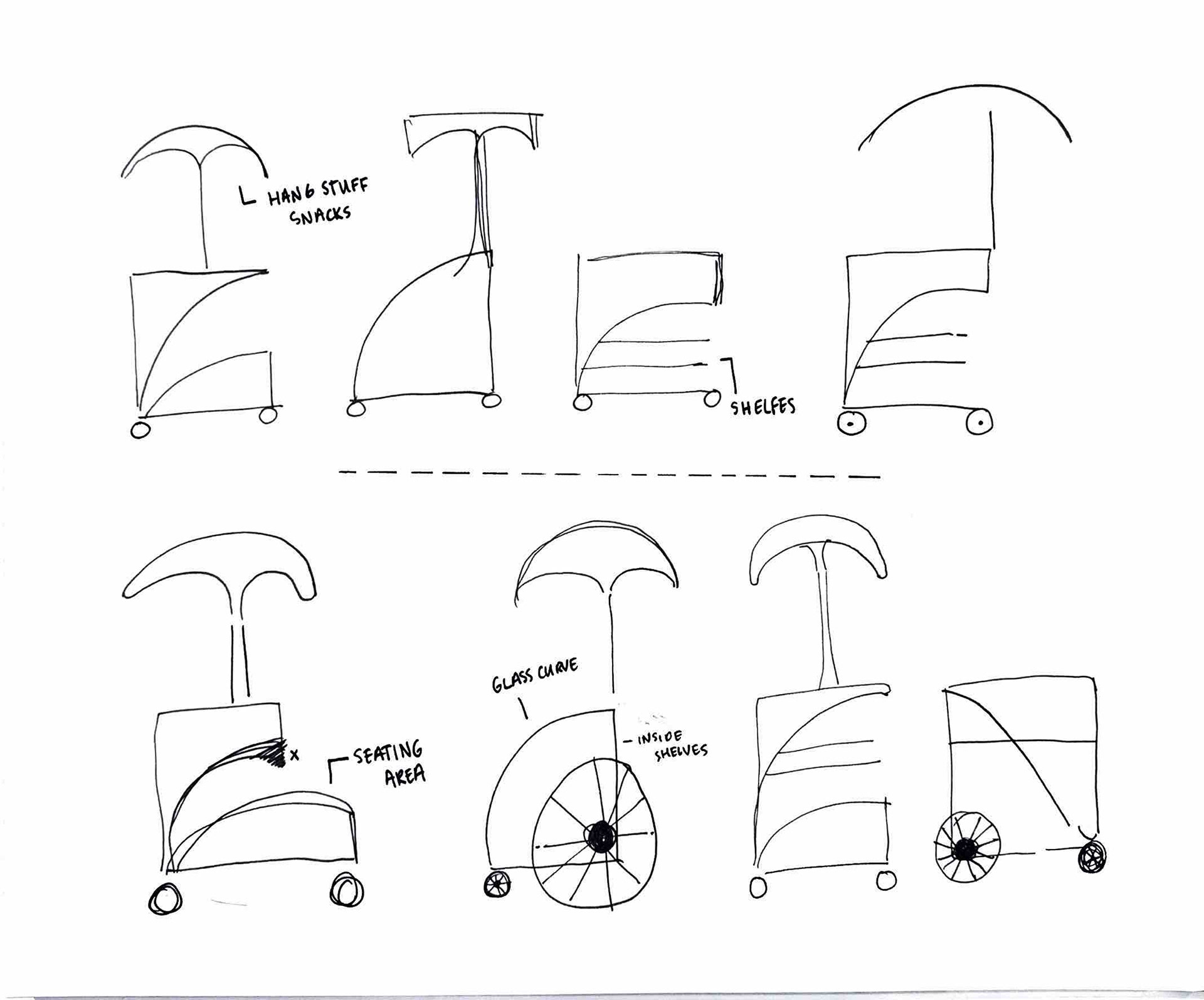
Physical outcome for Nintin
One fundamental part of our brands values included an ethical responsibility in everything we strived to make; including for us to be completely transparent with our customers so they could trust us. When we started discussing ideas on what we could sell or do for our branding we liked the idea of having a sustainable approach in one way or another.
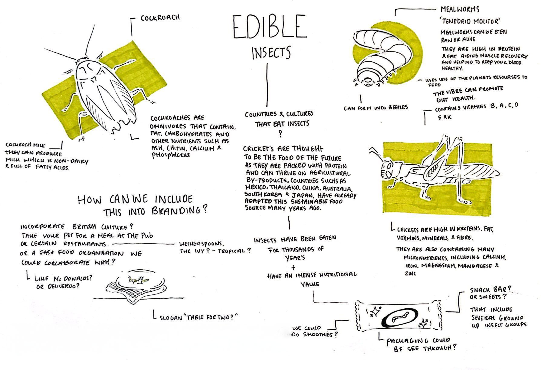
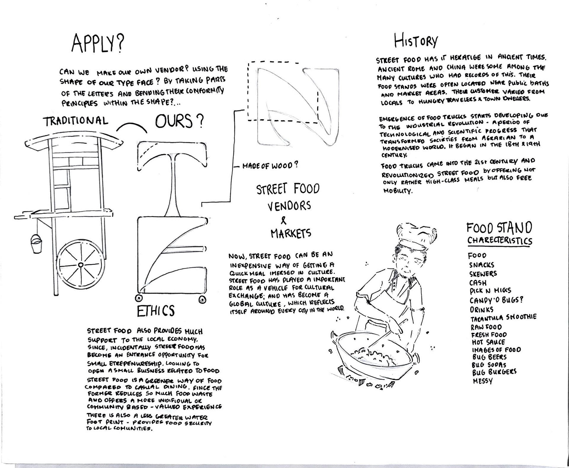
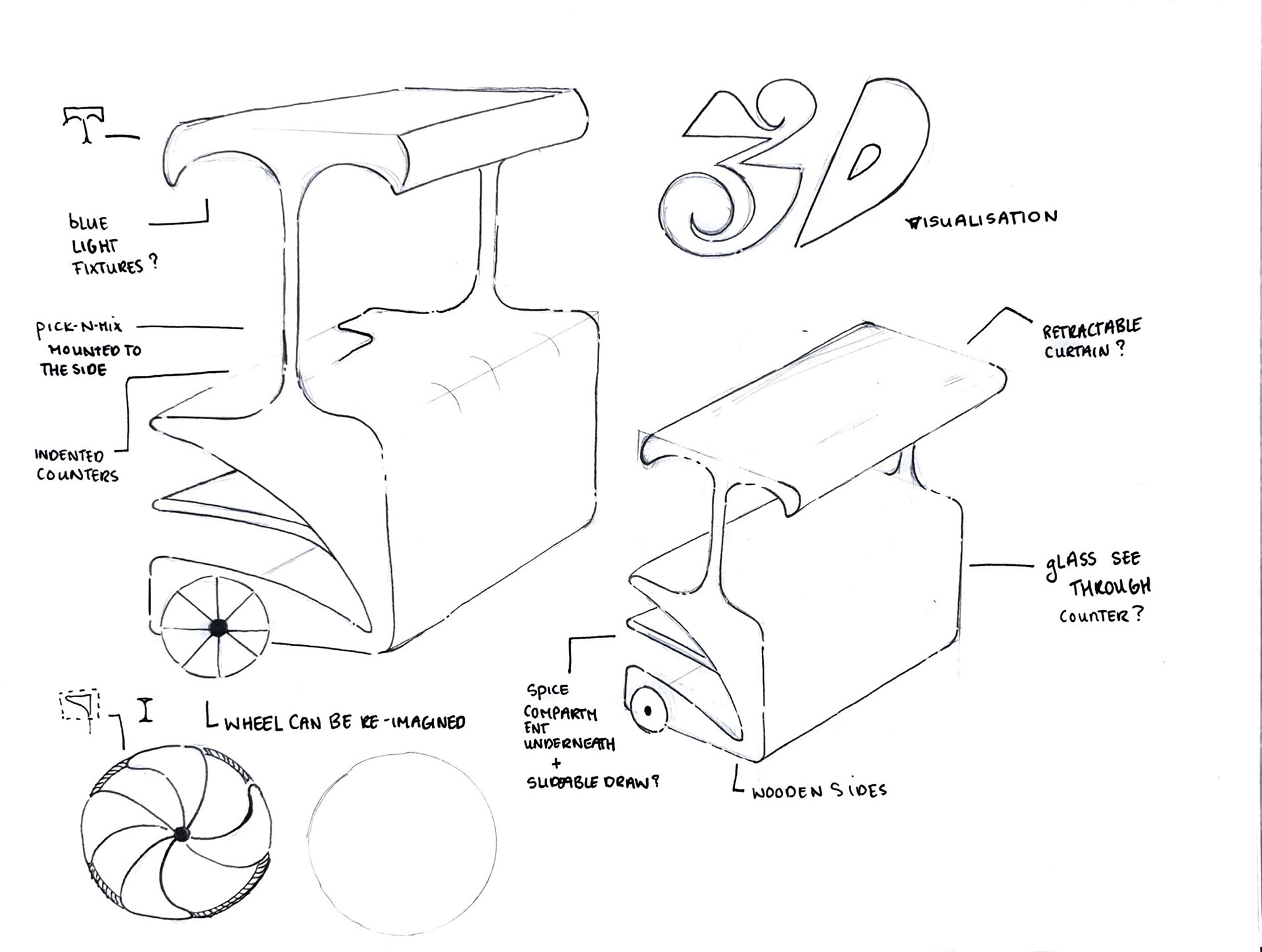
Insects are thought to be the food of the future – we realised. Most reptilians consume them. If it’s adequate for them, why not us? We started researching into insect diets and how beneficial they are to humans. Coming from a Mexican background myself, I am familiar with this peculiar cultural tradition; where crickets are enjoyed as a national delicacy called “Chapulines” my mother always told me it tastes “Just like chicken” personally I was never interested in trying it. Yet many other cultures have already adapted this sustainable cuisine to their lives, thousands of years ago too because of its high nutritional value. Slapping this product in some plastic packaging would’ve just contradicted everything we stood for as a brand; that strived to be beyond compare. So, we needed to figure out a sustainable yet unique way we could distribute this idea globally. We realised in Mexico this delicacy is usually served in a street food vendor with some lime and chilli. What’s stopping us from making our own but applying our wordmarks shapes, to a physical vendor for a distinctive physical touchpoint that isn’t just a mock-up. We imagined our innovative food vendor, to be constructed using shapes from our wordmark, conforming its basic principles to create something out of the ordinary, meanwhile allowing you to have a taste of what these nutritious insects can fundamentally add to your life.
When researching into the culture around street food we realised how adaptive this way of living truly is. Street food provides much support to the local community, and economy. Street food has also become an entrance opportunity for small entrepreneurship for those looking to open a small business related to food; and who might not be able to afford opening a large-scale restaurant. Street food is also a greener way of food compared to casual dining. Since the vendor reduces so much food waste and offers a more individual or community based – valued experience. There is also an insignificant, water footprint. Meanwhile providing food security to local communities during economic crises. As street food in our modern day and age can be an inexpensive way of getting a quick meal immersed in culture. Moreover, street food has played an important role as a vehicle for cultural exchange; and has become a global culture, which reflects itself around every city in the world.
